Email is 40x more effective than social media when it comes to customer acquisition. That’s right, Twitter, Facebook, Instagram and the rest are all great for getting exposure, but when it comes to turning initial interest into paying customers, nothing beats email marketing.
Of course, those stats aren’t based off of sending out cold email blasts at random. The success of email campaigns is largely due to permission-marketing, a technique first popularized by marketing expert Seth Godin.
Permission-marketing is exactly what it sounds like: a system where individuals give you permission to contact them with offers. This helps to ensure that the offers you send are relevant to their interests (and are much more likely to be taken advantage of).
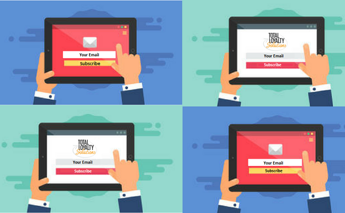
The easiest way to go about getting that permission is by placing a simple email sign-up form on your website. This is also the best way to continually build a list of contacts that are likely to become paying customers.
Whether you’re creating a sign-up form for the first time or want to increase the amount of sign-ups to your existing form: these following 3 steps will give you the best chances of growing your list of contacts and customers.
1. Make it Obvious…but not obnoxious.
Visitors to your site shouldn’t have to search all over to find your sign-up form, but no one likes to be attacked by a sprawling pop-up box before they even have a chance to view your site content. Make your sign-up form clearly labeled and easy to find. The top right corner and footer areas of websites are popular options, and if you are going to use a pop-up, consider the less intrusive side-bar type. Our recommendation? Keep it simple.
2. Give them a reason
This may seem like common-knowledge, but it’s often an overlooked component of sign-up forms. If you want your site visitors to sign-up for your emails, you need to provide an appealing enough incentive. What will you be sending them? The best dining specials every week, a monthly newsletter with upcoming events, exclusive discounts for email subscribers only? Make the reason broad enough to appeal to the entirety of your prospective market and if you need help thinking of ideas – check out our support articles or contact a coach.
3. Keep it simple
You want to ask for enough information to send your emails accordingly, and some additional information may can be useful for personalization and segmentation, but you don’t want visitors to feel like your sign-up form is a job application. For the majority of businesses, name and email will be more than enough.
And that’s it. A simple sign-up form on your website is one of the easiest ways to generate new customers for your business. Make it obvious, provide a reason and keep it simple.
And if you would like to continue to receive content on growing your loyal customer base, make sure to subscribe to our emails as well.

